Create calm, timeless interiors with neutral palettes in modern interiors using layered tones, textures, and smart design choices for a balanced and elegant home.
Neutral Palettes in Modern Interiors: The Complete Design Guide
Introduction
Walk into a well-designed neutral home and something shifts. The noise of the day quiets down. The space feels bigger than it probably is. There is nothing competing for your attention, and somehow, that feels like a relief.
That is the quiet power of neutral palettes in modern interiors. Not boring. Not safe. Just thoughtful.
This guide breaks down how to use neutrals effectively, which combinations actually work, and where most people go wrong.
What Are Neutral Palettes in Interior Design?
Neutrals are not just white and beige. The family is wider than most people realize.
In neutral color interior design, the core shades include warm whites, creams, beige, greige (grey-beige), taupe, warm sand, and soft charcoal. What makes them neutral is simple: they do not dominate. They support. They let the light, the furniture, and the materials speak instead.
That supporting role is exactly what makes them so useful in a home.
Why Neutral Palettes Work So Well in Modern Homes
There are real, practical reasons neutrals have held their ground in interior design for decades.
They age well. A bold teal accent wall might excite you for a year. Ten years from now, a cozy living room with wood and cream will still feel perfect. Neutrals do not follow trends because they were never part of one.
They reduce visual noise. Rooms with too much color competing can feel exhausting without you even realizing why. A neutral base gives your eyes somewhere to rest.
They make rooms feel bigger. Light neutrals reflect both natural and artificial light, which is exactly why beige and white interior design is so popular in apartments and smaller homes. The walls seem to breathe.
They are easy to live with and update. Swap the cushions, change the rug, add new artwork. Your neutral base handles all of it without clashing.
Key Elements That Make Neutral Interiors Work
Getting neutrals right is less about the color and more about everything else around it.
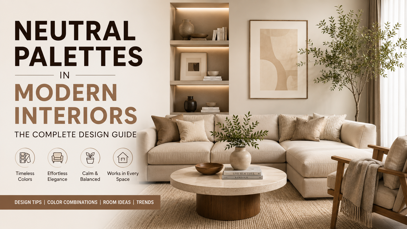
Layering tones: One flat neutral across an entire room looks unfinished. The trick is using three or four shades within the same family. Warm white walls, a deeper taupe sofa, a sand-toned rug, cream curtains. The variation creates richness without adding any color at all.
Texture is everything: This is the element most people skip and then wonder why their neutral room feels cold. In modern neutral home decor, texture does the work that color would normally do. Think rough linen against smooth marble, matte wood beside brushed metal, soft cotton on a stone floor. The contrast between surfaces is what gives a neutral room its personality.
Lighting makes or breaks it: Neutrals shift under different light more than any other palette. A warm white can look creamy and cozy at dusk and almost clinical under noon sunlight. Always test your chosen shades at multiple times of day before committing.
Edit ruthlessly: Neutral spaces rely on negative space. Every visible object should be there intentionally. Clutter destroys the calm that neutrals are trying to create.
Room by Room: Using Neutrals Effectively
**Living room:** Layer textures across upholstery, cushions, rugs, and curtains. Choose one statement furniture piece in a slightly deeper neutral to anchor the room. Mix wood, stone, and metal so the space has material variety even without color variety.
**Bedroom:** Soft tones like warm white, pale blush-beige, or light greige work well on walls. Layer the bed with linen, cotton, and waffle textures. Use warm-toned lamps rather than overhead lighting to keep the mood calm and restful.
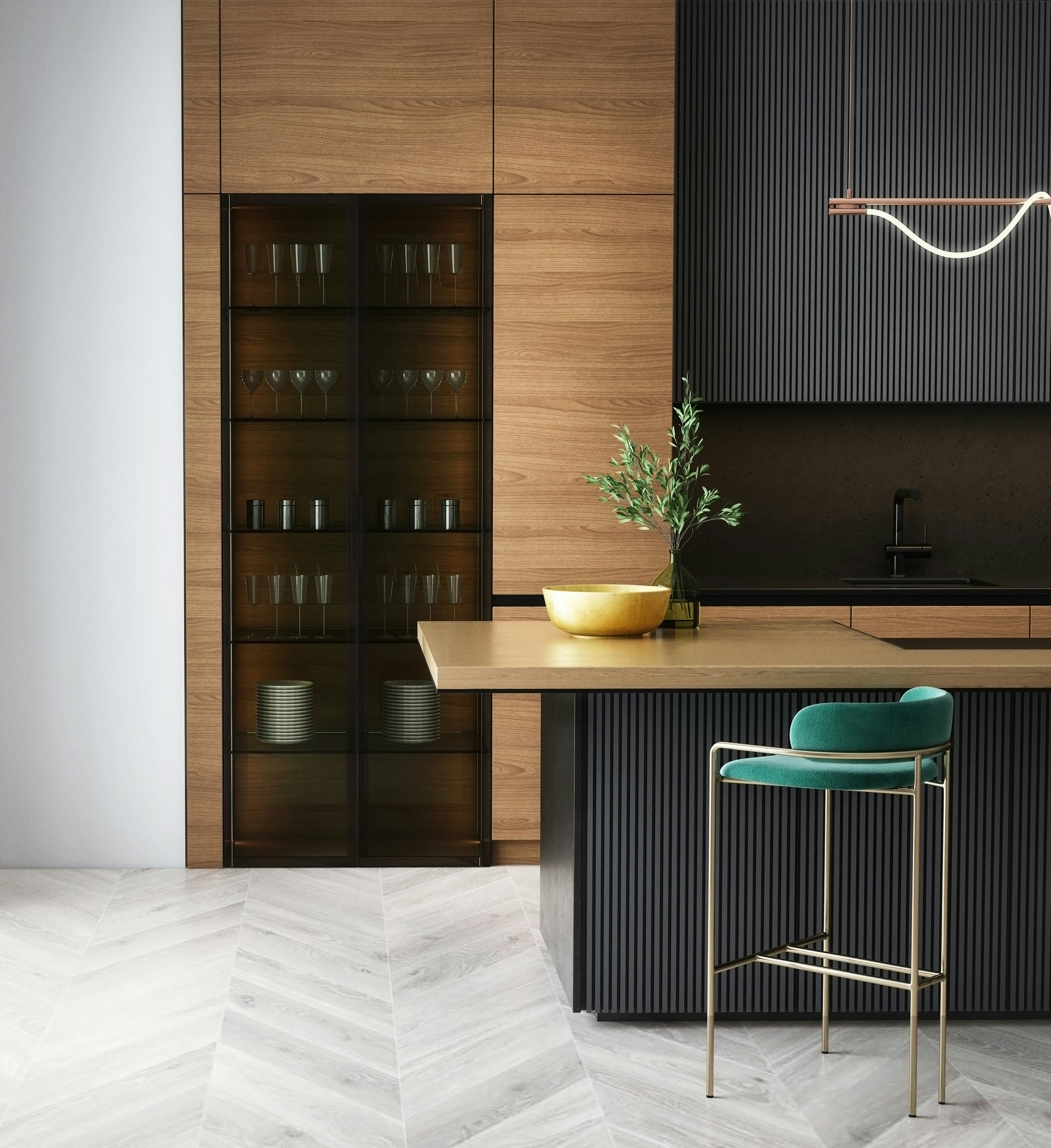
**Kitchen:** A darker island or stone countertop contrasts with a base of white or light grey cabinets. A wood-effect or natural stone backsplash adds texture without introducing color. Matte black or brushed brass fixtures pull it together.
Color Combinations That Actually Work
Some neutral pairings are reliable because they balance each other naturally:
• Beige + White: Warm and clean, works in almost any room
• Grey + Wood: The foundation of Scandinavian and Japandi interiors
• Cream + Gold accents: Feels luxurious without trying too hard
• Taupe + Black contrast: Sharp and contemporary, especially in smaller doses
Mistakes People Make with Neutral Interiors
Using only one shade. An all-white room with no tonal variation looks like a hospital, not a home. You need at least two or three values within your chosen palette.
Forgetting texture. If everything is smooth and flat, the room has no depth. No amount of styling will fix a space that lacks material contrast.
Poor lighting. Harsh cool-white bulbs are the fastest way to make a neutral room look grey and lifeless. Warm-toned bulbs and layered light sources are non-negotiable.
Overdecorating. Neutral spaces need breathing room. Filling every surface defeats the purpose entirely.
What is Trending Right Now
Warm neutrals have overtaken cool greys in most contemporary spaces. The shift toward camel, greige, and warm sand reflects a broader move toward comfort and organic materials.
Japandi style continues to influence neutral design, blending Japanese restraint with Scandinavian warmth. Earthy tones paired with indoor plants and natural wood are everywhere. Layered minimalism, fewer things, better chosen, is replacing the maximalist phase that dominated social media a few years ago.
Adding Character Without Adding Color
A neutral palette does not mean a blank personality.
• Oversized artwork or a curated gallery wall introduces focal interest and story
• Indoor plants add organic color and freshness that complements neutrals naturally
• Mixing rough and smooth, matte and reflective materials creates visual depth
• Subtle patterns on textiles, like thin stripes or geometric weaves, add quiet movement
Conclusion
Neutral palettes in modern interiors work not because they play it safe, but because they give everything else in the room room to breathe. The light, the materials, the furniture, and the people inside all read more clearly against a quiet backdrop.
Done well, a neutral home feels effortless. Getting there takes intention, layering, and the right guidance. If you are ready to bring that kind of calm and character into your space.
Reach out to the DecoGully team and book your free design consultation today.
FAQs
What colors are considered neutral in interior design?
White, off-white, cream, beige, grey, taupe, greige, and warm sand tones. They act as non-competing backdrops that let other elements in the room stand out.
Are neutral interiors boring?
Only when done poorly. Layered tones, varied textures, and intentional styling make neutral spaces feel rich, warm, and full of quiet detail.
How do you make neutral interiors look luxurious?
Invest in quality materials like marble, solid wood, and linen. Brushed metal accents, curated artwork, and layered warm lighting do the rest.
Which neutral color is best for small spaces?
Warm white and light cream reflect the most light and create a sense of openness. Avoid heavy or dark neutrals on all four walls in compact rooms.
Can I mix warm and cool neutrals?
Yes, carefully. Let one temperature dominate and use the other as an accent. A warm beige base with a cool grey cushion adds dimension without visual tension.


CommentsBe the first